When clients hire us for product photography services they see the benefits of our pro studio setup. However, it’s often not feasible to hire a photographer to take 150 or 500 product photos, and renting spaces like our Fort Collins photography studio isn’t always possible or feasible.
At the same time, the pictures of your products can make or break your online store. So what’s to be done?
This is one of the classic conundrums of product marketing. The good news is, technology caught up a while ago, and most of us have the gear for free on our phones to get pretty close to pro-level. This article is written as a case study demonstrating some basic techniques we would use to solve a few problems in a basic single-light setup.
This client wanted the industry-standard white infinity backdrop. With minimal expense, we were able to set them up with a home studio to let them build their product photos at their leisure, during the development process.
Infinity Wall At Home
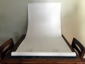
We new right away the sunlight was going to be trouble, and hadn’t planned on trying to use it. One note if want to try using the sun: plan to move quickly. Plan to adjust to variations in your light source.
Lighting
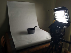
We decided for sake of ease to use our own lights. You can use most any light source, but you want bright! A dim light will make it very difficult to wash out the white background. We were fortunate enough to have access to Kinoflow’s 4 x 2′ bank with some daylight balanced fluorescent tubes.
After closing the blinds and adding our light bank, we placed the product and started pondering light positioning.
It’s important to consider many different factors when photographing products. We wanted a flattering soft light on the product, but not necessarily full center on the subject. To mimic what the sun had been doing through the window, placed our Kino bank high up and to the right of the product.
Then it was time to place the camera.
Camera Considerations
But for longer exposures, it is essential to have a tripod or some way to ensure the camera doesn’t get bumped or moved in any way while taking the shot.
Once we had a starting position for the product, our light, and our camera, we framed up the product in our lens and took our first shot.
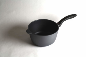
We weren’t expecting anything special from the first shot, but we were pleasantly surprised to see the basic elements were already fairly close. The paper texture could still be seen. We weren’t nearly bright enough yet, but it was a start:
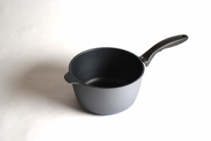
At this point we decided to slow down the shutter further. Here again, it’s essential that the camera was absolutely still to capture the slightly longer exposure we were needing to really bleach out the background:
Now we were getting somewhere. The product was well-lit with just our single light and the background was gone in over half the photo. But how to get that last bit? Of course a second light would do it…but then we’d have to change the name of this post! Even a longer exposure could possibly do it, but we had a second problem if we increased exposure. The elements nearest the light – the handle and right edge of the pot – were at their maximum exposure. We risked blowing out some of the product details and washing out the color if we upped our exposure time any more. For a minute, it looked like a second light might be the best option…
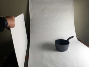
The solution was a $3 foam board from the local art shop. Rather than a second light source, redirecting some of the original light with a “bounce” can give you many options for better illumination while keeping the nature of your one-light setup intact.
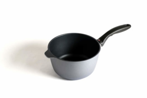
The foam board was so light, we were able to rest it against the paper roll coming away from the wall. We could immediately see that the light and shadows were flatter, but maintained. The final shot had the white background nearly washed out from side to side, but showing a nice beginning surface for our infinity wall.
With the final photo taken, we brought it into Adobe Fireworks to manage one final tweak: we increase the contrast, and bumped the brightness just enough to wipe the remaining texture from our paper background.
The final image has nice color and composition, placing the focus entirely on the popping product itself.
Bare Essentials:
Light
Bounce surface
Camera (ideally something that lets you control exposure and sensor settings (ISO)
Paper Roll (3′ by however long you wish to have – this roll can be used many times, even cutting off damaged or marked paper as it’s used)
Flat surface near a wall
Permission to tack paper to the wall
Thumbtacks
Bill lives and plays in Fort Collins, Colorado. After a fulfilling career for a Fortune 50 company, Bill founded Colorado Web Design in 2012 with a passion for creative digital solutions for business. Bill likes to manage a wide variety of projects and tasks for his clients in the digital space. The creative elements of website design, application design, and marketing are enough to keep anyone busy and engaged, but wiping the slate clean over and over at the start of new projects comes with its own challenges. "I like to start with really good client communication sessions. The rest is easy if you get started in the right way." He plays tennis, bikes, and hikes and then undoes all of that with too much delicious food and TV watching.
About Colorado Web Design
We've been building websites for Colorado businesses since 2002. We are a small team of dedicated individuals who love the challenge of each new marketing project. We live and play in northern Colorado.

