Project Debrief: Earth Elements Design – Photography Dream Project
- January 8, 2016
- Photography, Project Debrief
Sometimes a project comes along that makes designers swoon. If you’re lucky enough to build a site where the content is already created, and marvelous in it’s own right, then the site can be a real pleasure to design and build.
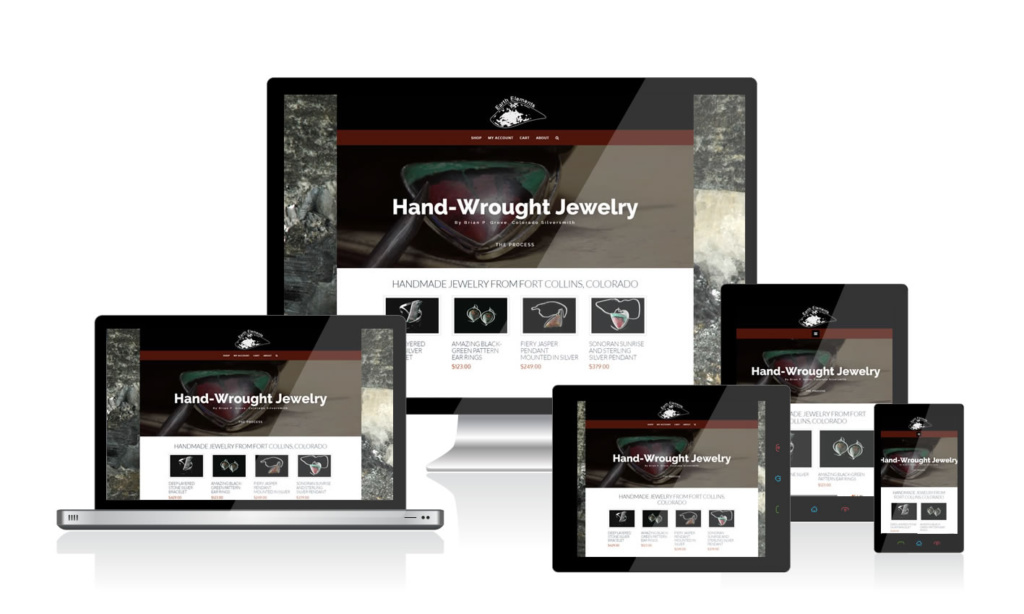
This is the case with Earth Elements Design, a Fort Collins, Colorado jewelry studio making astonishing hand-made silver jewelry with amazing, polished, natural stone settings. The project called for a website where the pieces could be highlighted and sold.
What started as a hobby for artist Brian Grove had morphed into a true passion, and while the buzz he generated with each new piece led to a lot of sales to a network of early supporters, it was time to formalize the studio with a website that could really show the character of each piece, and lead to a legitimate eCommerce solution easy enough to manage without the artist needing to spend hours on every new piece of jewelry. 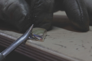
Colorado Web Design proposed WooCommerce as our recommended eCommerce platform of choice and the website development was underway.
This is when things got interesting. While the early goal was to use “earth tones” throughout the website, the wide variety of “true earth tones” found in the rocks of the jewelry was causing a lot of color dissonance in any layout we tried.
No matter how muted our color scheme, we kept finding jewelry pieces that just didn’t quite pop when placed into the browns and reddish tones we were using. On top of that, we started by having the artist photograph each piece of jewelry with his phone on pieces of brown burlap.
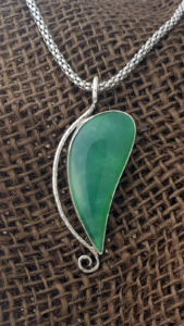
We say it in our website boilerplate, and we will say it again here: “photos can make or break a website.”
For Earth Elements Design, our Fort Collins photographer started experimenting with traditional jewelry photography techniques, and quickly realized that traditional techniques are in use for a reason: they work!
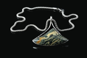
While the client wanted to avoid a website that looked like Zales, once he’d seen our classic glossy black photos of his designs, we all turned the page.
Turns out, black is an earth tone!
For the project, we started with a standard light box (in this case, the EZCube) and daylight balanced flourescent bulbs in softboxes. This is critical! You can use tungsten balanced or daylight balanced lighting, but if you are going to have any light bleed, you should identify the color of that light, and try to match it. If you end up with different color temperatures in your lighting set up, you will never get the final color to look right in your photos.
For jewelry, a long lens on a camera with decent resolution is required to get sharp focus, with decent roll off into bokeh (that lovely out-of-focus effect). I’m lucky enough to own a Canon 5D Mark III with a Zeiss ZF 100mm lens, so getting the shots would be simple, but this is another important point: you don’t need thousands of dollars worth of equipment, but it’s advisable to invest in a few hundred dollars of camera equipment at least. Any entry-level DSLR that allows for interchangeable lenses will likely do. The real trick is in the lens and the light. And the background. And the camera settings.
OK, there is a lot to it.
The artist had a glossy white bust, and with our glossy black background concept, we had two great photo set-ups we could repeat fairly quickly with each piece.
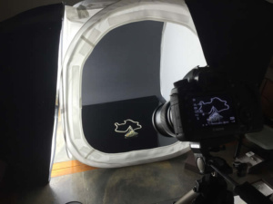
Where the plexiglass is reflecting the construction paper, you have your perfect, reflective surface. We used two lights, one on each side of the EZCube, and a third light from time to time, either to bring out darker colors, or highlight textures where needed.
This last point is another good one to consider: every piece of jewelry is going to vary to one degree or another. This project had a wide range of shapes and colors creating some special situations. Darker stones needed more light, brighter stones needed far less light. Without needing to really change the setup over and over, a third light offers good flexibility. Just about any third light will do if it matches the colors of the other lights. More important for this light is for it to be something smaller that is easy to move around. Certain angles reflect off the stones surface better than others.
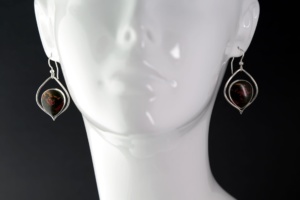
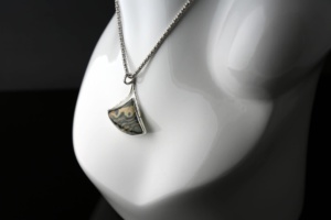
The second setup used the glossy white bust for both pendants and ear rings to better demonstrate how each piece looks “in action”.
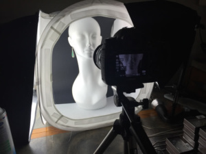
For a few minutes we played with trying to even out the light on the two sides of the bust, but we finally concluded that the character of light was nice when it was uneven. This is true in most portrait setups, and even with a blank white bust, the shadows tell part of the story.
Ultimately each piece had two different images constructed using the EZCube light box. Any setup that can bathe your subject in soft light will bring nice results like these, but a light box really creates a consistent setup for every shot that is hard to beat.
The final results really highlight the quality and interest of each piece, and the good news is, the light box is easily manageable, along with the bust and plexi-glass, to create an environment that is easy to set up, and quick to photograph. We’ll be shooting many more pieces of jewelry in the coming months, and we know precisely how to duplicate these first results.
With the images in place, we taught Brian how to upload and maintain his product portfolio, in order to keep his own site fresh with his latest creations. Every product page is search engine ready, and with product that is click bait on social sites like Instagram and Facebook, this socially enabled eCommerce engine will do a masterful job getting the word out about the new pieces that come online.
Ultimately, the Earth Elements Design website was a pleasure to create, and the artist’s terrific work is ready for the world!
Bill lives and plays in Fort Collins, Colorado. After a fulfilling career for a Fortune 50 company, Bill founded Colorado Web Design in 2012 with a passion for creative digital solutions for business. Bill likes to manage a wide variety of projects and tasks for his clients in the digital space. The creative elements of website design, application design, and marketing are enough to keep anyone busy and engaged, but wiping the slate clean over and over at the start of new projects comes with its own challenges. "I like to start with really good client communication sessions. The rest is easy if you get started in the right way." He plays tennis, bikes, and hikes and then undoes all of that with too much delicious food and TV watching.
About Colorado Web Design
We've been building websites for Colorado businesses since 2002. We are a small team of dedicated individuals who love the challenge of each new marketing project. We live and play in northern Colorado.

